Our scroll site looked terrible on phones. The animation was fine.
We replaced a video with a canvas image sequence and it got worse. The cause was two lines of arithmetic sitting inside our own draw function that nobody had run.
We built a scroll-driven site where the page position drives a film. Video first, then a canvas image sequence, because seeking video is unreliable across browsers and Apple's product pages solved it years ago by drawing frames to a canvas instead.
The sequence shipped and it looked worse than the video it replaced. Soft, over-sharpened, obviously wrong on a phone. We assumed the encoding was at fault and spent an afternoon on quality settings.
It was not the encoding. It was geometry.
A canvas covers its box
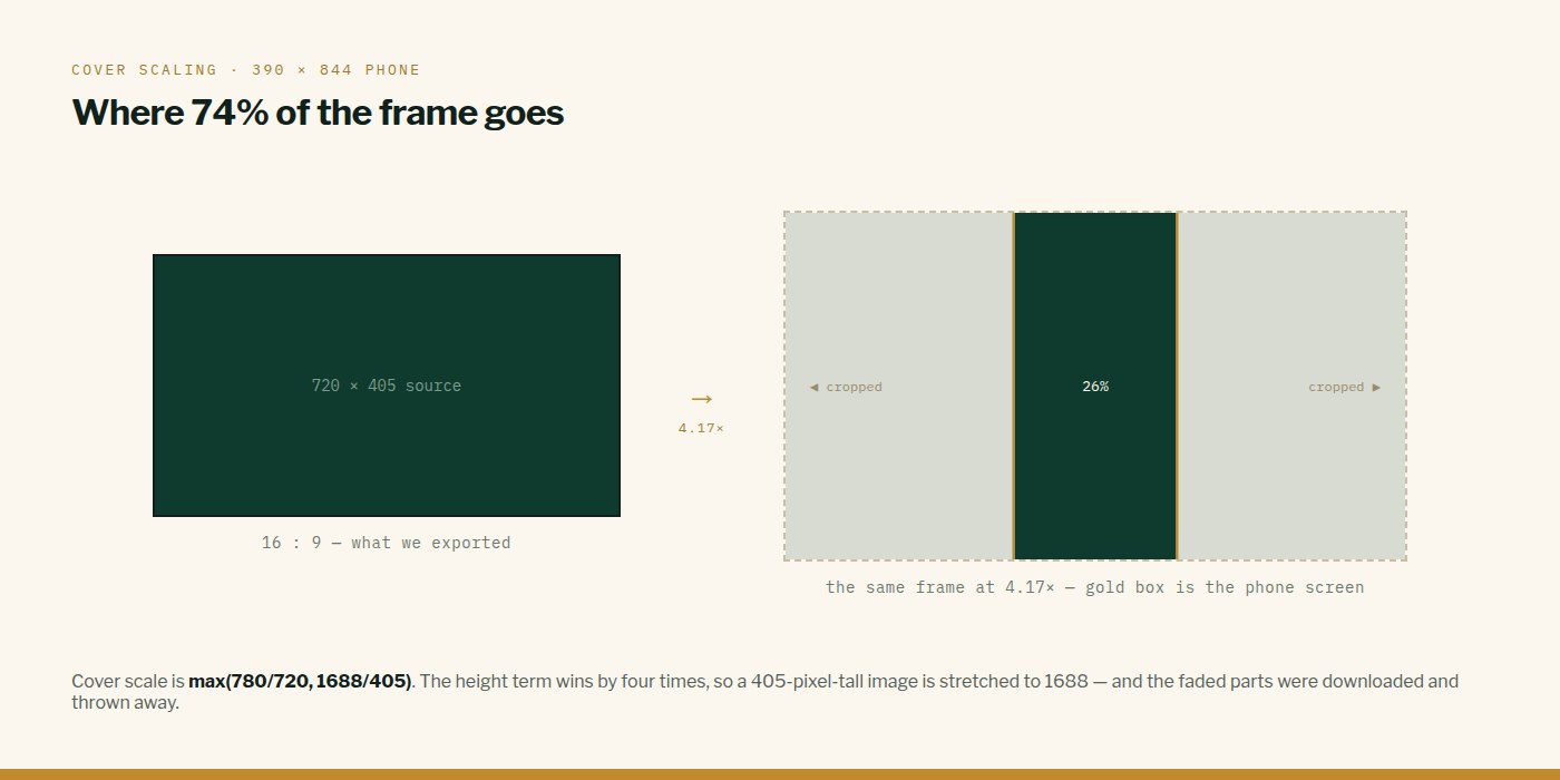
Cover scaling takes whichever axis needs more and scales to that, then crops the overflow. On a portrait phone a 16:9 frame has to be blown up until its HEIGHT fills the screen — and by then most of its width is off-frame entirely.
Measured on a 390x844 phone with a 720x405 frame:
textcover scale = max(780/720, 1688/405)
            = max(1.08, 4.17)
            = 4.17x  UPSCALE

drawn size    3001 x 1688
visible slice 26% of the frame's width
A 405-pixel-tall image stretched to 1688 pixels. Of course it looked soft.
Shipping one sequence for every screen shape was the mistake
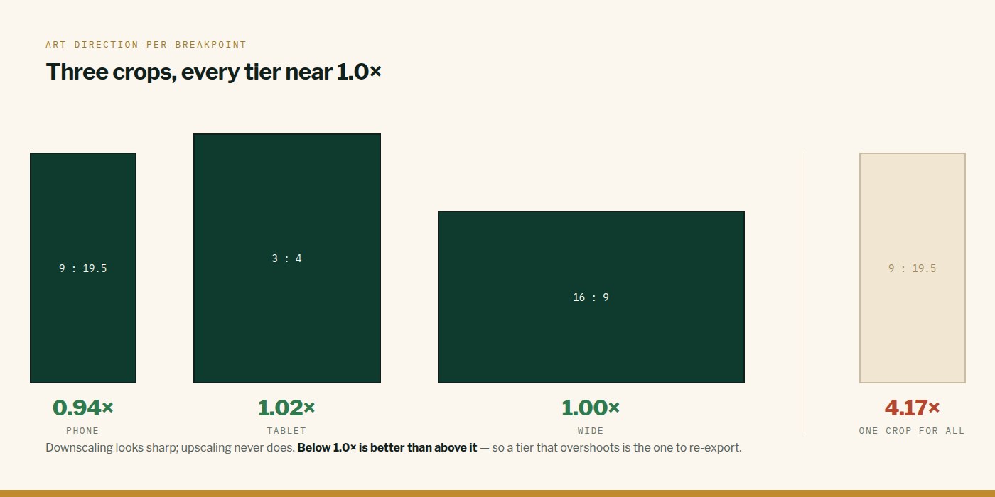
The fix is not a higher-quality encode. It is three crops, cut from the source at roughly the aspect ratio each will be shown at, selected on aspect rather than width alone so a phone held sideways gets the wide cut and not a portrait slice stretched across the screen.
| Tier | Frame | Payload | Scale at display |
|---|---|---|---|
| Phone | 540 x 1170 — 9:19.5 crop | 6.7 MB | 1.08x |
| Tablet | 810 x 1080 — 3:4 crop | 8.8 MB | ~1.1x |
| Desktop | 1600 x 900 — 16:9 | 14 MB | 1.00x |
Every tier now renders between 0.53x and 1.00x. Downscaling, which is where images look sharp. The phone tier is barely larger than the sequence it replaced.
Cap device-pixel-ratio per tier, not globally
A global cap of 2 undoes the work: on a high-DPR phone the canvas backing store doubles and your carefully sized frame is upscaled again. The cap belongs with the tier that chose the frame size.
tsconst TIERS = {
  phone:  { dir: "/seq-phone",  dpr: 1.5 },
  tablet: { dir: "/seq-tablet", dpr: 1.25 },
  wide:   { dir: "/seq-wide",   dpr: 1 },
};

const dpr = Math.min(window.devicePixelRatio || 1, tier.dpr);
The reel is a background under a veil with text over it. Fill rate spent beyond that buys nothing you can see.
The actual lesson
Check the ratio between your asset and the box it is drawn into. The calculation was two lines inside our own paint function and nobody ran it — we reached for encoder settings because that felt like the kind of thing that fixes blurry images.
If an image looks soft, measure the scale factor before you touch quality settings. Anything above 1.0 is the answer.
This is what we do
Work of this kind is Web Development and Performance & SEO — the same hands that wrote this.
Written by Taha Virdiwala at RiverPoint Web & App. Everything here was measured on a real build — if you are hitting the same thing and it is not landing, tell us what you are seeing.